
The last few weeks I’ve been working on two projects, VeraType and Radiate. VeraType is an entertainment productivity app that converts images into text and text into images. Radiate is a online design and development environment in the early beta stages. I’ve had a few breakthroughs on both.
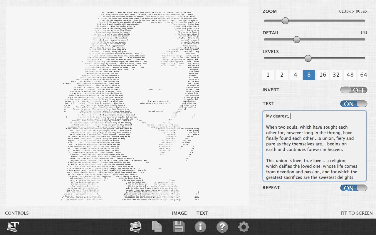
In VeraType there’s a feature that lets you load in an image and then type in a word, phrase or even a page or two of text and the app will arrange the text into the shape of the image as shown below.

In the app this is called the custom text option. It looks like this:
Click on the images to see a full size preview.
This had some issues. First, if you don’t provide a lot of text then the shape of the image is indiscernible. So I added an option to repeat the text so it would fill out and form the shape of the image. So if you typed, “hello” it would be repeated maybe 1000 times until it was the size you specified.
This worked for a while but what if you wrote a letter and you didn’t want to repeat it? You could manually adjust the detail level until it showed just the text you wrote or the app could do it for you. This posed a new challenge. Previously you would provide the image and the size (detail) and the text would fill that area. But now to show only the text someone types you have to size the text field until it fits the text. The size has to be determined. This became the size to fit option. In the app you would set the repeat option to off to achieve this.
Warning: Technical explanation ahead. You can skip the next few paragraphs.
The first method I used was to create the text image at the smallest size and increase the size step by step. On each step I would check if all the typed text was there. If it wasn’t then increase the size once more (you only had a certain number of rows, which were determined by the height of the image, so the text would get truncated). If the text wasn’t all there I’d create the text image again and repeat this process until it was.
This was fine if there wasn’t a lot of text. But as the words and phrases grew into paragraphs so did the rendering time. When the size and repeat option was enabled, which is the default, it would only take a single pass to generate the text and that took anywhere from 5 to 300ms (debug performance measurements). But since we didn’t want to repeat the text and the size was not available it would take up to 300 passes or more at 5 to 300ms each. It was becoming clear that this would cause problems for mobile devices.
The second method which I worked on this week used the phone book method I read about but never used before. Oddly enough, this method is related to origami. In this case, which I think they call a needle in the haystack situation, you have a very large set of data but if that data is ordered then you can divide and conquer or divide and reduce.
In this method you start in the middle of the data, check where you are and then go forward or backward into the middle of your previous location until you have less and less results.
So for example, if you are looking for someone named Michael Thompson in the phone book using this method you would split the phone book in half and check if he’s on that page. If he’s after that page then you split the pages in half again but this time from the middle, the page you are on now, and the last page and check that page. If he’s before that page then start from the page you are on to the previous location you were at and check again. You repeat this process until you get to the page you are looking for. If the phone book was 100 pages long then the sequence we described would start on page 50, go ahead to page 75, go back to page 62 (62.5), go ahead to 68 (68.25) and so on until we find him on page 68.
End technical explanation.
Long story short it went from 1 – 400 iterations down to about 8 or 9 no matter how much text I entered in.
The second feature I worked on was to enable a background image. See below. Click on the screenshot to see a full size preview.

This had it’s own set of challenges.
Technical explanation.
I added an image behind the text but it didn’t always size and position correctly so I bound the image size and position to the text size and position. This exposed all sorts of issues that the text image had that I didn’t resolve earlier on. At different sizes and especially when the images had borders, the text and image would end up scaled or size down. This was because the text field would shrink down to fit the widest row or highest column. This didn’t work when the background image was shown.
The solution was to include a second text field that had the exact number of characters wide and exact number of rows including the blank lines at the end of the non repeating text. Without that the height of the text field was too short and so the image was too short even though it had the correct width.
End technical explanation.
All in all it was a productive week.
I forgot there was one more feature. That’s the swap color scheme option.

I like this option more than I thought I would. It gives the image some contrast. Enjoy.
For more information visit the forums here.