This tutorial will explain how to create great type compositions and text art using VeraType for Android or VeraType for Win and Mac.
This is part one of a three part series.
Part II – How to convert text into an image
Part III – Sharing your type compositions
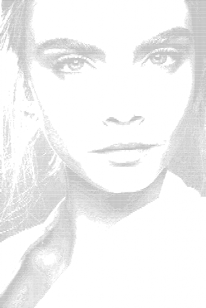
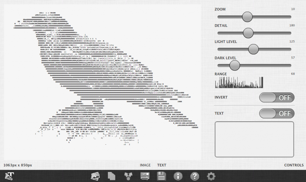
The first image we’ll create is made out of letters of the alphabet (a set of letters, numbers and punctuation known as the ASCII character set).
Here is the first final image.
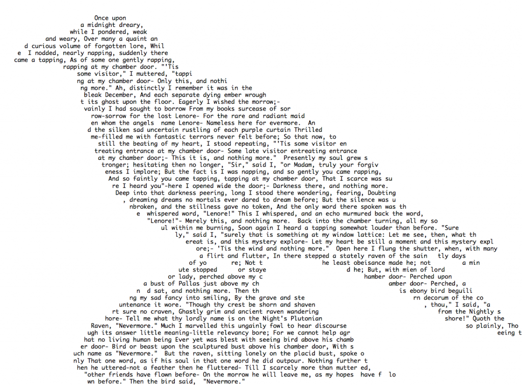
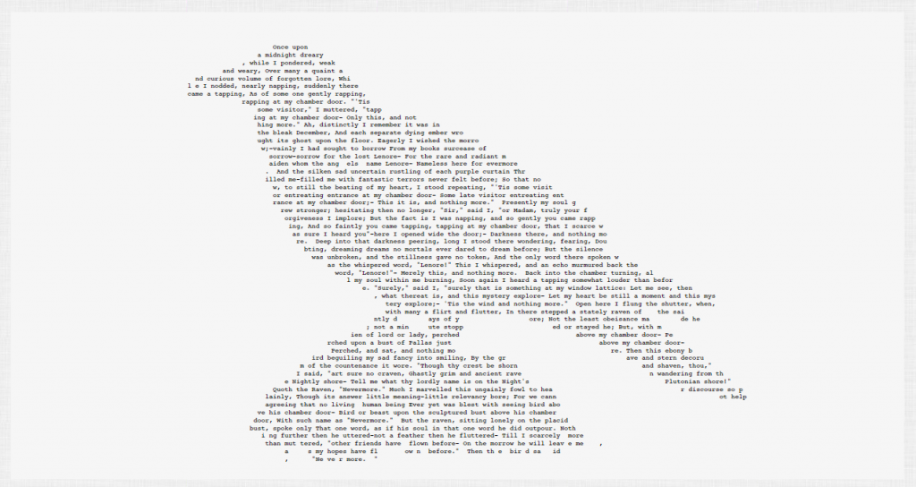
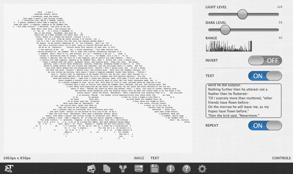
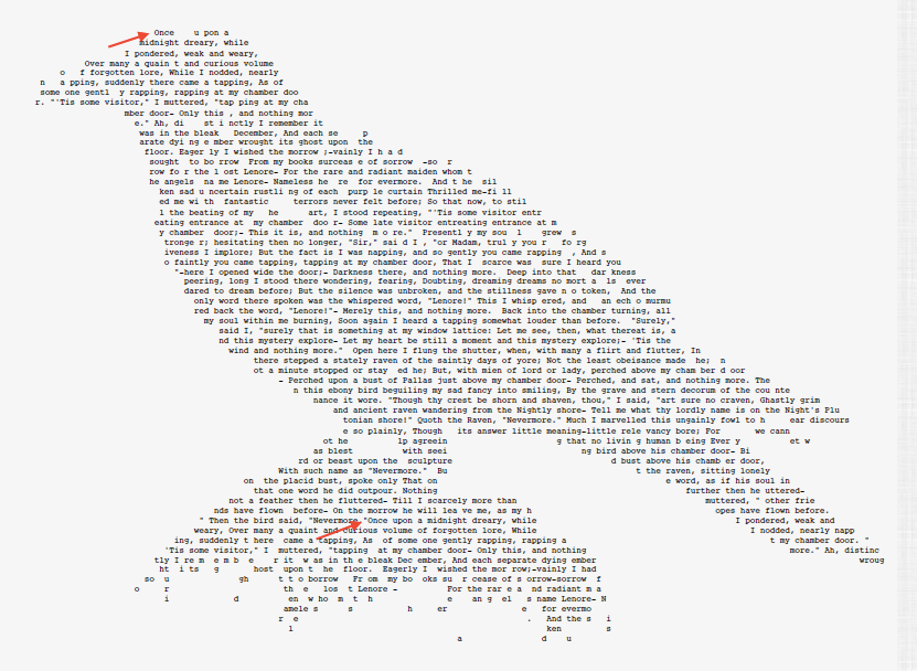
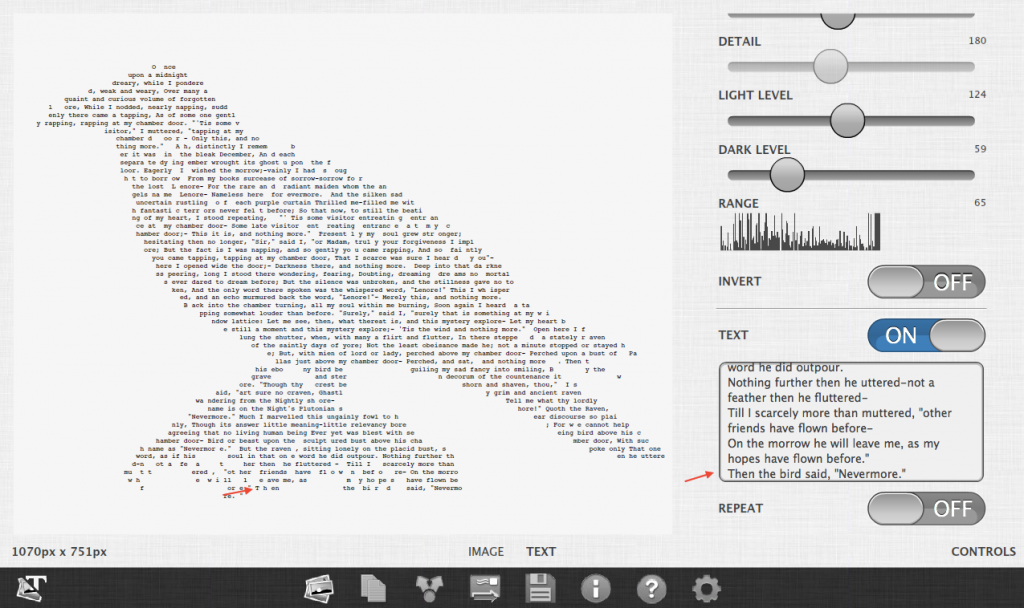
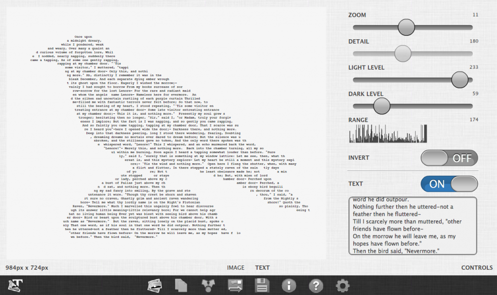
The second image we’ll create is an poem in the form of an image. Here is that final image.
Summary
- Import image
- Make adjustments
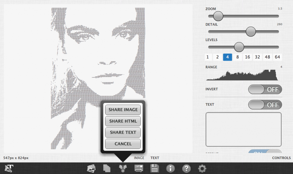
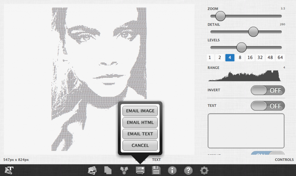
- Share and Export
Importing the image
To create ASCII art we need to start with an image. On the desktop version we can add an image from our computer. On a mobile device we can add an image from the camera roll or image gallery. If you don’t have any images do a quick search online and save them to your camera roll.
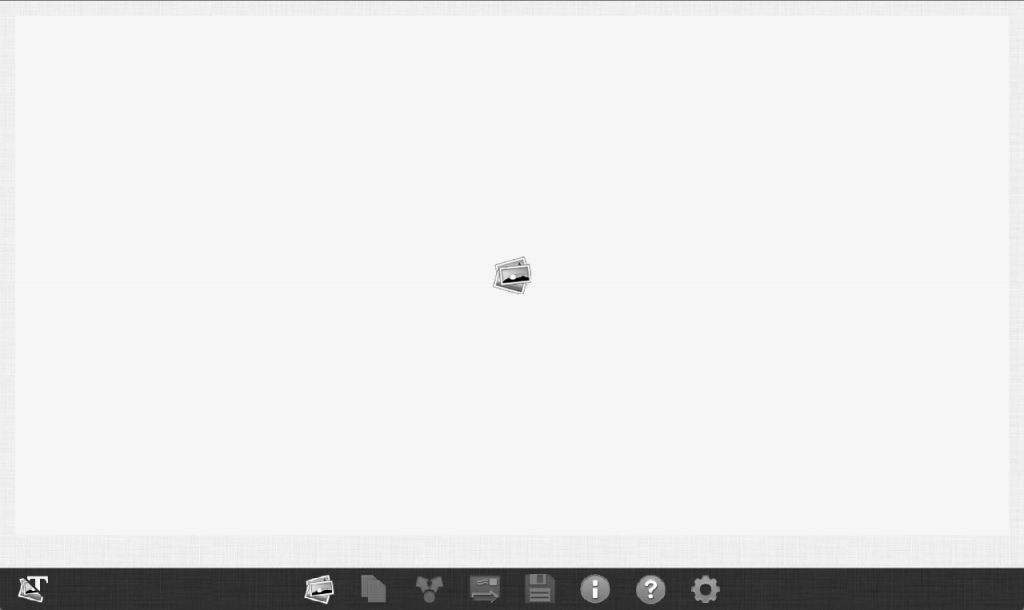
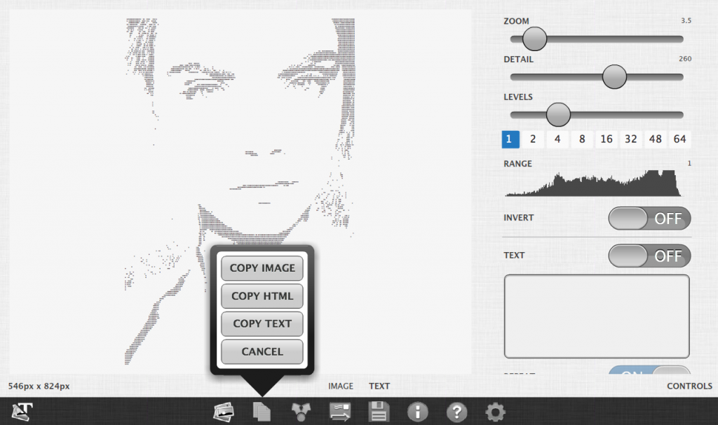
![]() To select an image click on the image gallery button and select the image from your computer or mobile camera roll. Note: You may need to add images to your camera roll to use. Search online for what you’re looking for.
To select an image click on the image gallery button and select the image from your computer or mobile camera roll. Note: You may need to add images to your camera roll to use. Search online for what you’re looking for.
Once you’ve selected an image it can take up to fifteen seconds to convert the image the first time. When it is completed the controls panel will be visible.
Making Adjustments
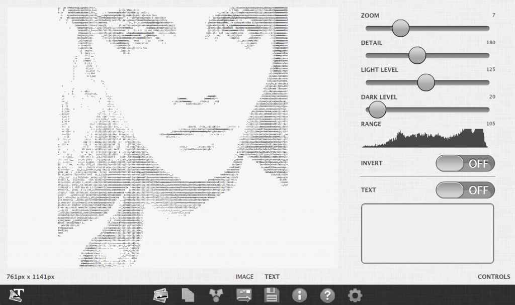
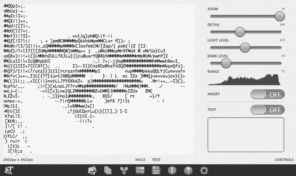
The first thing you will want to do is make adjustments. I usually increase the dark levels by about ten. This increases the contrast. I then adjust the brightness level up or or down until I get a look I’m looking for.
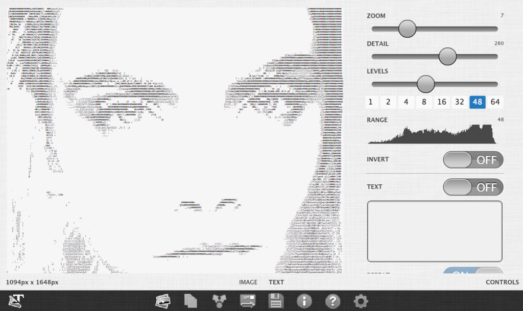
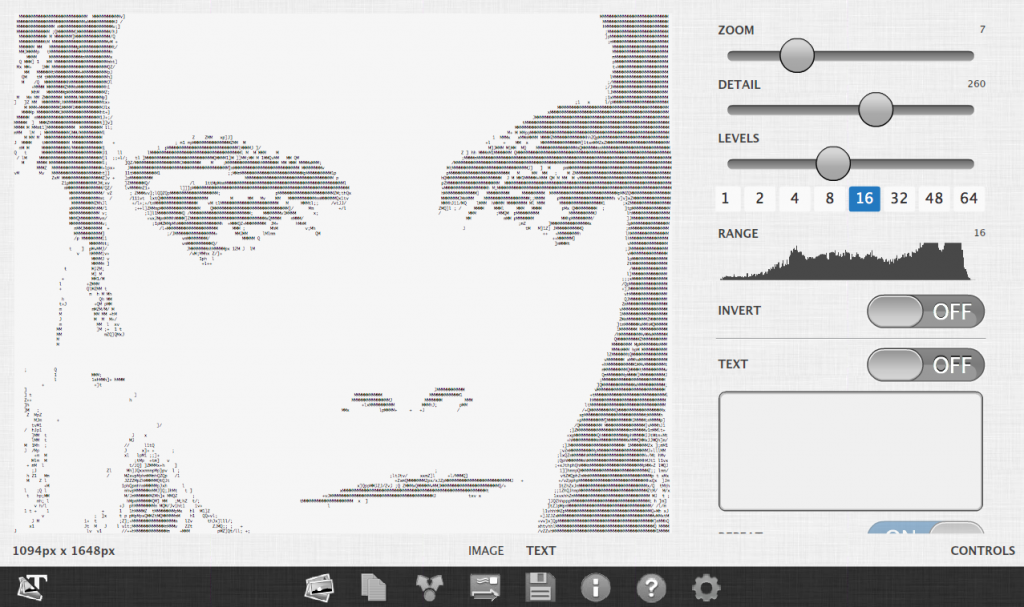
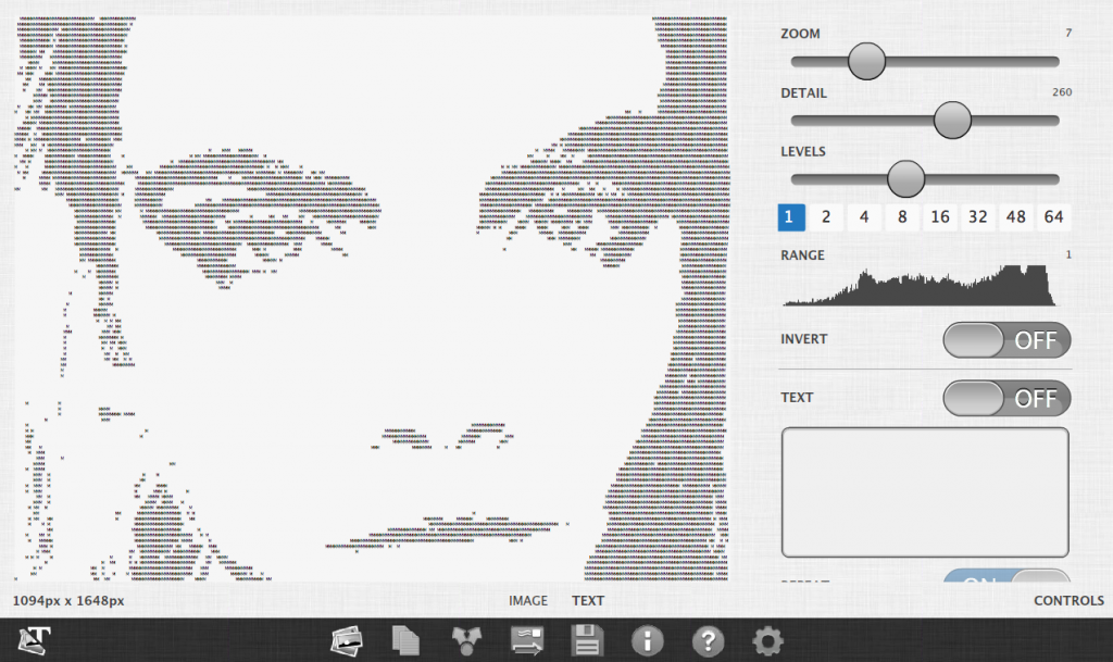
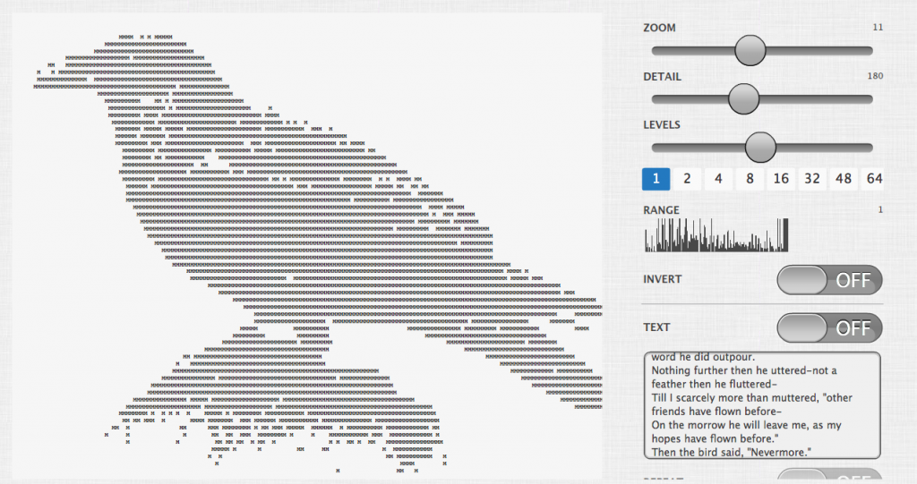
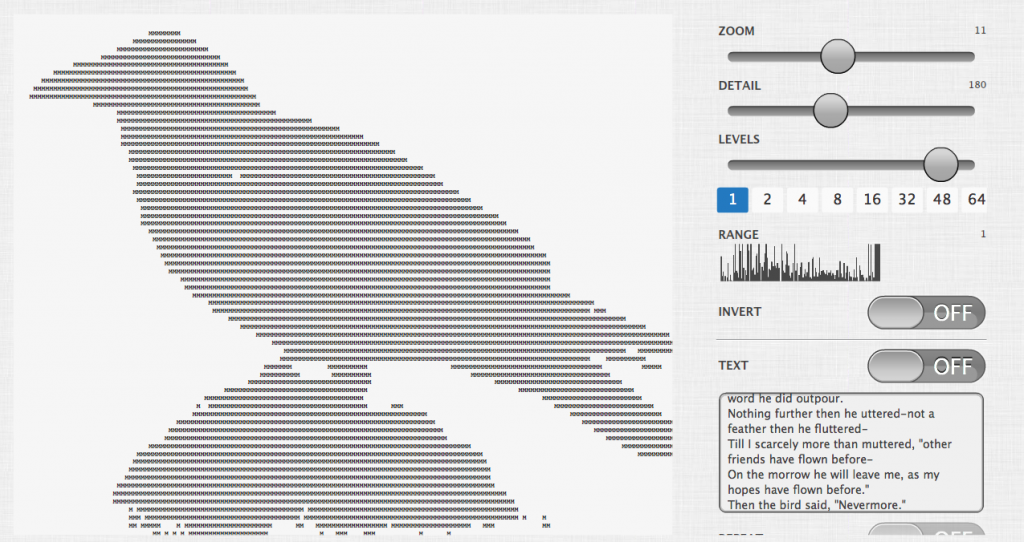
Alternatively, you can use the Levels slider to change the image grayscale range. Go into the settings and enable the switch, “Levels Controls”. The following images show the difference in range at 48, 16, and 1.
Changing the Level value up or down changes the brightness value in the range you selected. This changes the amount of characters in the picture.
Zoom and Detail
Once the image is loaded you can can zoom in and out using Zoom slider. This allows you to see the letters up close or pull out to see the whole picture.
BTW Font size and zoom are synonymous in this program.
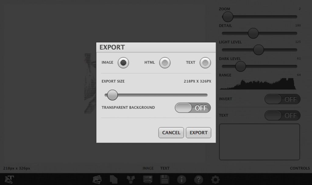
If you are zoomed out too far you will see banding. These appear as thin lines. This means the font size is too small. If you export your image at too small a font the banding will appear in the export. Before you export set the font size to 8 or above. You can change this in the export options. The suggested default font size is 10 to 12.
The amount of detail in the image is adjustable. You can increase the quality by increasing this value. Warning: Be careful not to set this too high on a slow device. When you increase this value the processing time will also increase. If you set the detail level too high it will take a long time to process but you will get a much better quality image. You can keep this value at a medium and increase it before you export or share your work.
Some images do not convert well. Illustrations that contain one or two colors convert well (see Figure 1). Images with strong light and dark areas and strong defined edges work well (see Figure 2). Images that contain no strongly defined edges do not work well (see Figure 3).
This is the end of part I. Continue to the next sections to learn how to convert text into an image and how to export and share your work.
PART II – How to convert text into an image
PART III – How to export and share your type compositions
If you like this application please let others know about it.
© All images copyright their respective owners.

